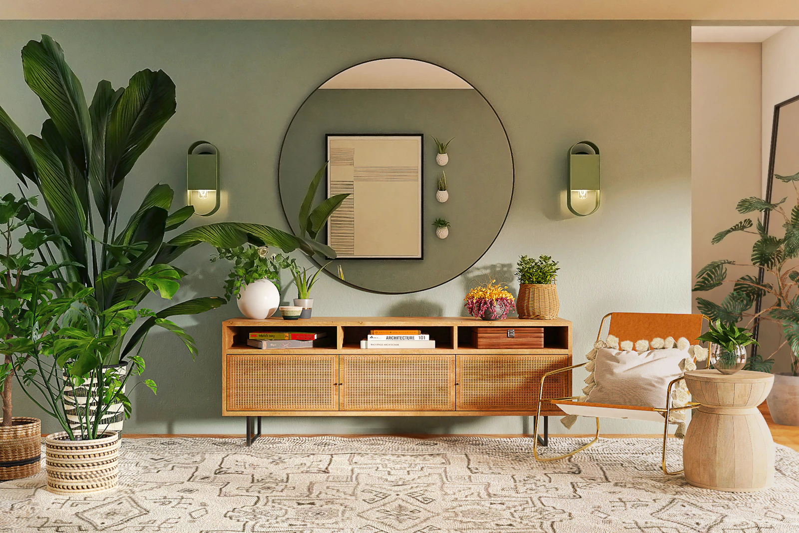
Start with the colors you cannot change
Floors, countertops, large sofas, brick, and tile usually outlast a paint decision. Look at those surfaces in daylight and name their undertone: yellow-beige, pink-beige, green-gray, blue-gray, or a relatively clean brown. A wall color that fights a large fixed surface will keep looking wrong no matter how fashionable the name on the chip.
If you are unsure, place a sheet of printer paper next to the wood or stone. Paper is a crude but useful reference. Wood that looks orange against paper will usually quarrel with cool gray paint.
Undertones
Undertone is the secondary color inside a surface. A “greige” can lean green, violet, or brown. A “white” can lean yellow, pink, or gray. Two colors with the same lightness can still clash if one is green-gray and the other is purple-gray.
Test undertones in pairs, not in isolation. Hold a paint sample against the sofa, then against the floor, then against the trim. The sample that looks acceptable in all three places is more useful than the one that looks beautiful on the card.
Warm versus cool palettes
Warm palettes gather around cream, clay, olive, terracotta, and honey woods. Cool palettes gather around blue-gray, stone, pewter, and some walnuts that read ashen. Mixed palettes can work, but they need a bridge: a greige that sits between, a material such as linen or unsealed wood, or a limited accent used on both sides of the room.
Problems appear when a cool gray wall meets a yellow oak floor with no intermediate tone, or when a warm beige wall meets a blue-gray sofa and both are large. One of those large surfaces usually needs to move toward the other.
Illustrative color families only. Not a specification for paint products.
Color proportions
A practical working ratio is large / medium / small. The large color is usually walls or a big sofa. The medium color appears in rugs, curtains, or secondary seating. The small color appears in cushions, ceramics, or a lamp. If the strongest color occupies the largest surface, the room can feel louder than intended. If every surface is a different medium color, the room can feel busy without having a clear accent.
Repeat the small color at least twice. A single terracotta vase in an otherwise gray room can look misplaced. The same terracotta in a vase and a book spine and a small frame starts to look chosen.
Natural lighting considerations
North light is cooler and can push yellow-beiges toward dull and blue-grays toward stark. South and west light can intensify warmth and make reds and yellows more assertive in the afternoon. Always view samples on the wall you intend to paint, at least once in the morning and once after dusk with your usual lamps on.
Lamp color temperature matters. A wall chosen under daylight-balanced bulbs can look muddy under warm bulbs, and the reverse is also true. If you cannot change the lamps, choose color with those lamps on.
Common mistakes
- Choosing a wall color from a phone photo of someone else’s room.
- Testing a sample only in the center of a wall, away from floor and furniture.
- Using several near-whites that do not match, especially on trim, ceiling, and walls.
- Adding a bright accent on a large surface before it has been tested as a small object.
- Ignoring wood undertones because the furniture is “neutral.”
Practical examples
Example A: oak floors, a beige sofa, and a desire for calm. A green-gray wall may fight the oak. A stone or clay-toned wall is more likely to sit with both the floor and the sofa. Olive then belongs in small doses.
Example B: white walls that feel cold next to walnut furniture. The wall may be a blue-white. Moving toward a softer ivory, or warming the room with lamp light and textiles, usually costs less visually than replacing the walnut.
Example C: a rental with fixed cool-gray walls. You may not paint. Warmth then has to come from wood, leather, linen, and lamps rather than from a new wall color. That is still a palette decision.
A short working method
- Photograph the room in daylight without filters.
- List fixed materials and their undertones.
- Choose a large, medium, and small color family.
- Test the large color against floor and sofa, morning and evening.
- Place the small color in at least two locations before committing to a third.
If you want a conversation about a specific room, you can request a color palette consultation. This guide is not that consultation.