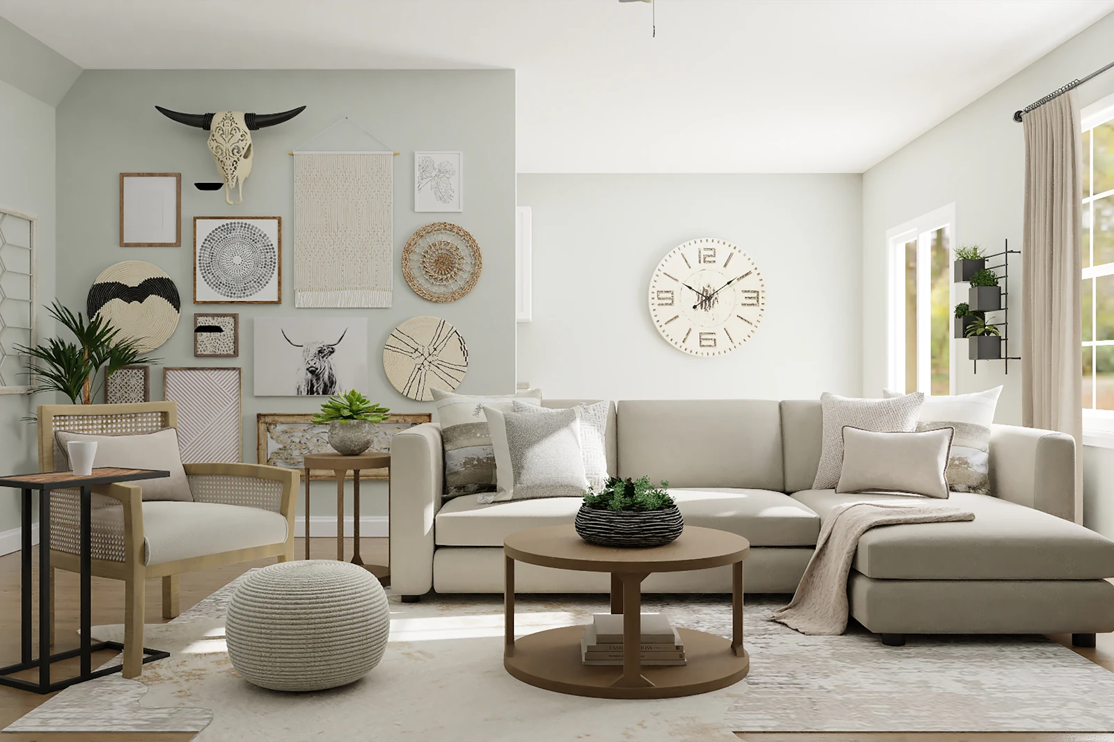
Consistent materials
Count the finishes. A typical living room might include oak, black metal, brass, marble, rattan, chrome, and painted MDF. That is often too many. Cohesion improves when you pick two or three structural finishes—say, oak, black metal, and linen—and let other materials appear only in small objects.
Wood tones do not have to match exactly, but they should share warmth. Mixing a yellow pine table with a cool, gray-washed oak floor is a common source of visual friction. If you cannot replace either, use a rug and textiles as a buffer rather than adding a third wood.
Complementary textures
Texture is how a limited palette stays interesting. Smooth plaster next to nubby wool next to a matte ceramic reads as considered. The same color applied to three shiny surfaces can look flat or, conversely, too polished for a room that is meant to be sat in.
Pair opposites in modest amounts: a hard coffee table with a soft rug, a sleek lamp with a loosely woven throw. If every surface is rough, the room can feel rustic without relief. If every surface is glossy, the room can feel brittle.
Color repetition
Repeat a color so the eye can track it. If olive appears on a cushion, let it appear again in a book spine or a plant pot. If terracotta appears only once, it can look like a leftover. Repetition is not the same as covering the room in one hue; it is a thread, not a flood.
Keep the number of distinct hues low. Many cohesive rooms use a neutrals field plus one supporting color plus one occasional accent. Pattern can count as a color if it introduces several new hues at once.
Decorative hierarchy
Give the room a primary object, a few supporting objects, and background objects. The primary might be the sofa, a piece of art, or a window. Supporting objects are lamps, tables, and a rug. Background objects are smaller accessories. When accessories compete with the sofa and the art, hierarchy collapses and the room feels noisy.
Scale supports hierarchy. One larger painting usually organizes a wall better than six miniature frames of equal size, unless those frames are composed as a single block with consistent spacing and related frames.
Visual rhythm
Rhythm is the spacing of similar things. Lamps at related heights on either side of a sofa, or a repeated wood tone at intervals around the room, create a beat. Even spacing is not mandatory; large / small / large can be more interesting than equal gaps. What tends to fail is random placement of similar objects with no interval relationship at all.
Walk the perimeter with your eye. If every wall has a different idea—gallery wall, TV wall, plant wall, empty wall—the room may need one of those ideas to quiet down.
Common styling mistakes
- Matching every metal finish exactly, then adding a leftover chrome object that breaks the set.
- Buying themed decor that announces a style name instead of relating to existing materials.
- Treating every gift and souvenir as a required display item.
- Using too many small patterns with no solid surfaces between them.
- Copying a photograph without accounting for a different floor, light, or sofa color.
Related consultations include home decor styling and room styling.